We heard you (and agree) that our original Landing Page Template (which will eventually be decommissioned in late 2026) does not quite compete with others out there. We’ve been working hard at a solution and have just released a more powerful Page Builder for you to use! ✨

Below are some tips to help you dive right in! There's also a video walkthrough 🎥 at the bottom of this help doc if you learn best through video and audio.
We’re on a long-term mission to refine the existing Teachery look and feel and our first stop is the Page Builder. Given it is slightly different, you might want to spend a bit of time familiarizing yourself with the different menus.
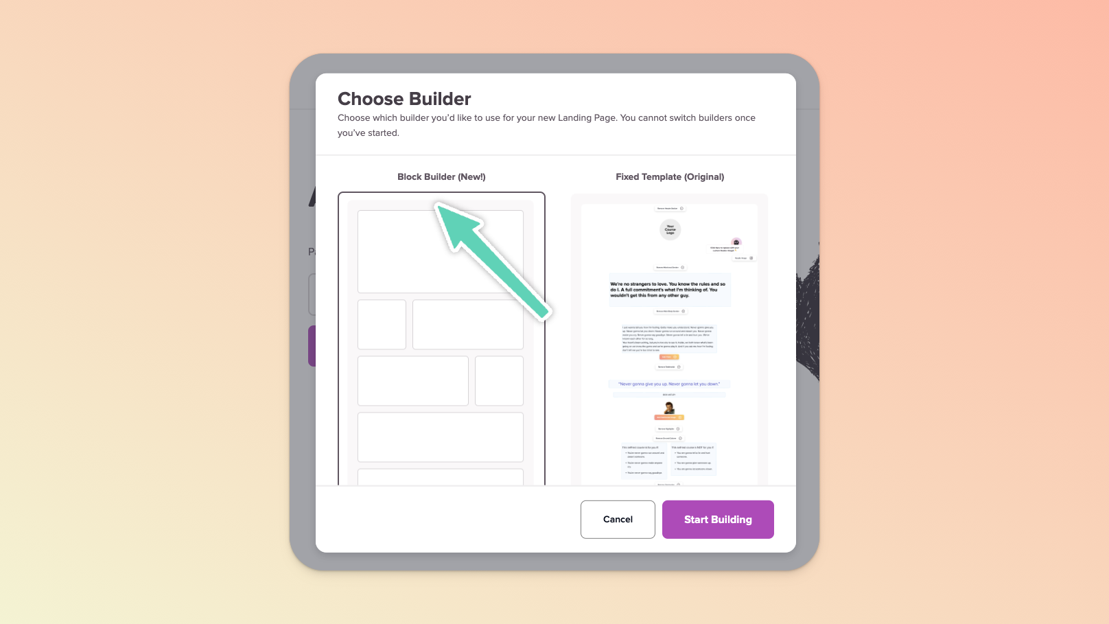
To find the Page Builder, edit any Course in your account and then scroll down the left sidebar to find the Landing Pages section. Click + Add Landing Page and then select the Block Builder in the popup that appears.
The Page Builder has two main menus:
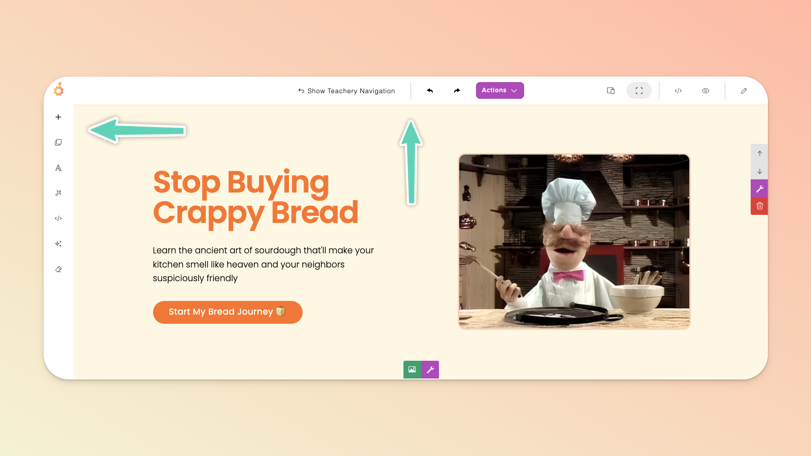
The LEFT menu is where you can add sections, drag-and-drop elements/content blocks, select typography/font styles (for either the whole page or per section), animate your content, add custom HTML code, use the optional AI Assistant, and clear all the content on your page.
The TOP menu allows you to show/hide the standard Teachery sidebar navigation you’re used to, undo/redo an action, manage/duplicate/delete the page via the Actions dropdown button (including managing the page URL, name, and connected email provider), toggle between different device views (so that you can check the page’s responsiveness on, for example, a mobile device), switch to full view, open a preview in a new tab, or keep the edit panel open.
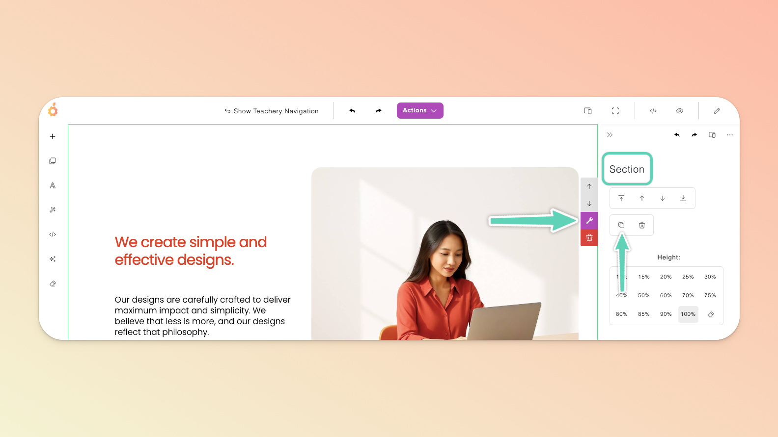
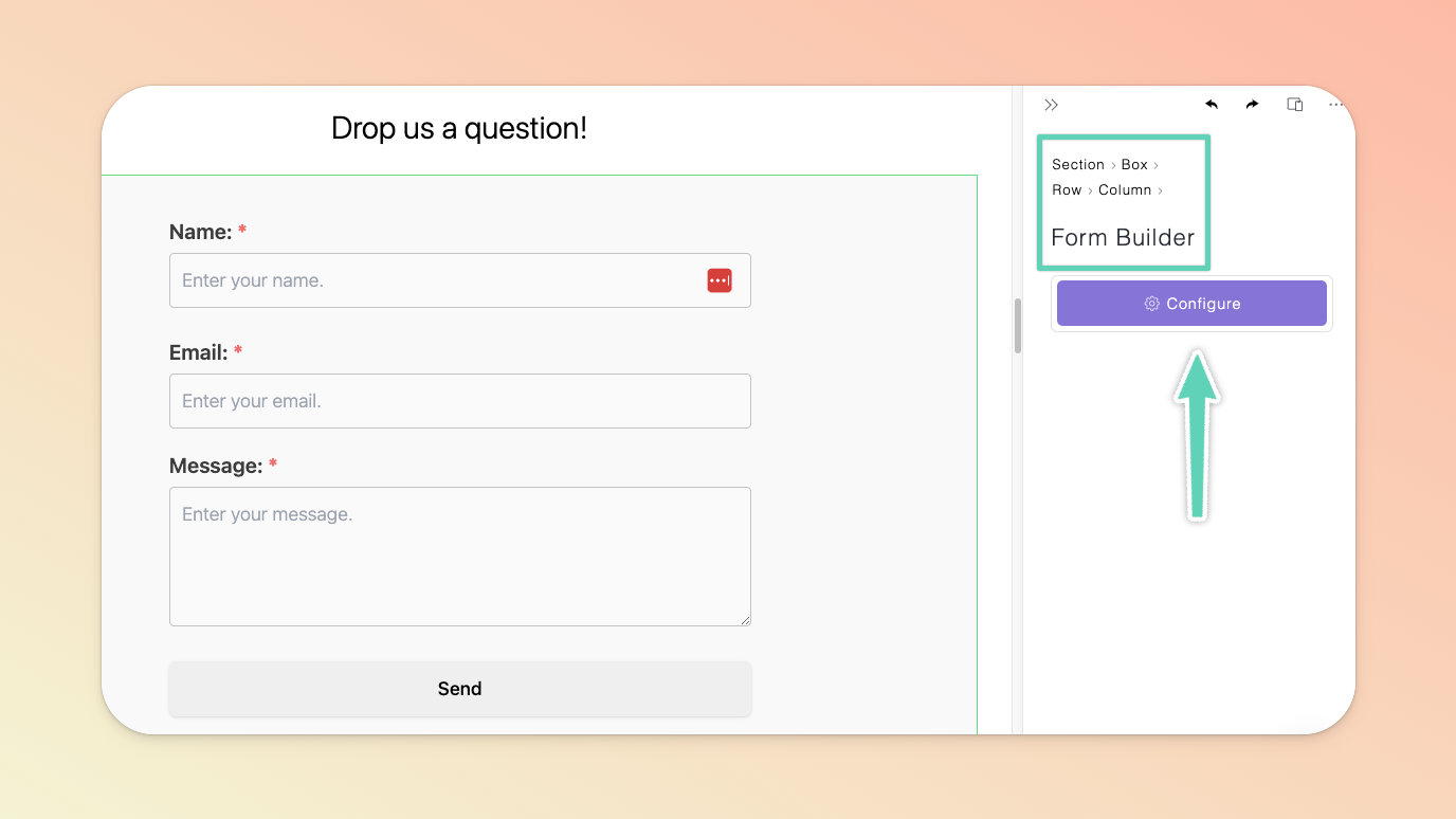
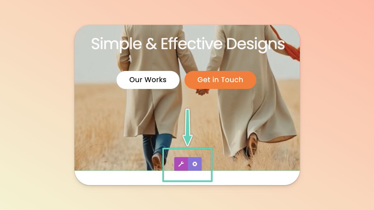
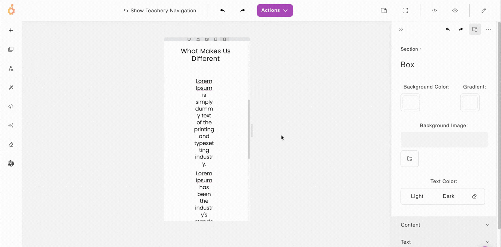
Every Page is made up of Sections which are themselves made up of Boxes and then any number of nested elements (a.k.a. Content Blocks within Rows and Columns).
E.g. the header of your page (a section) might have a box/block made up of a row/grid of two columns (elements) which in turn hold other elements like text, buttons, and images.
This will be handy to know when you’re initially diving in and wanting to edit/adjust the settings of a very particular part of a page. 😉
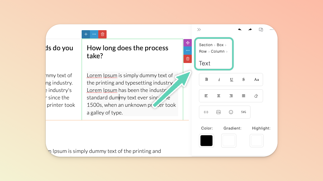
In the example above, this “features” section is made up of a box, rows, columns, and text.
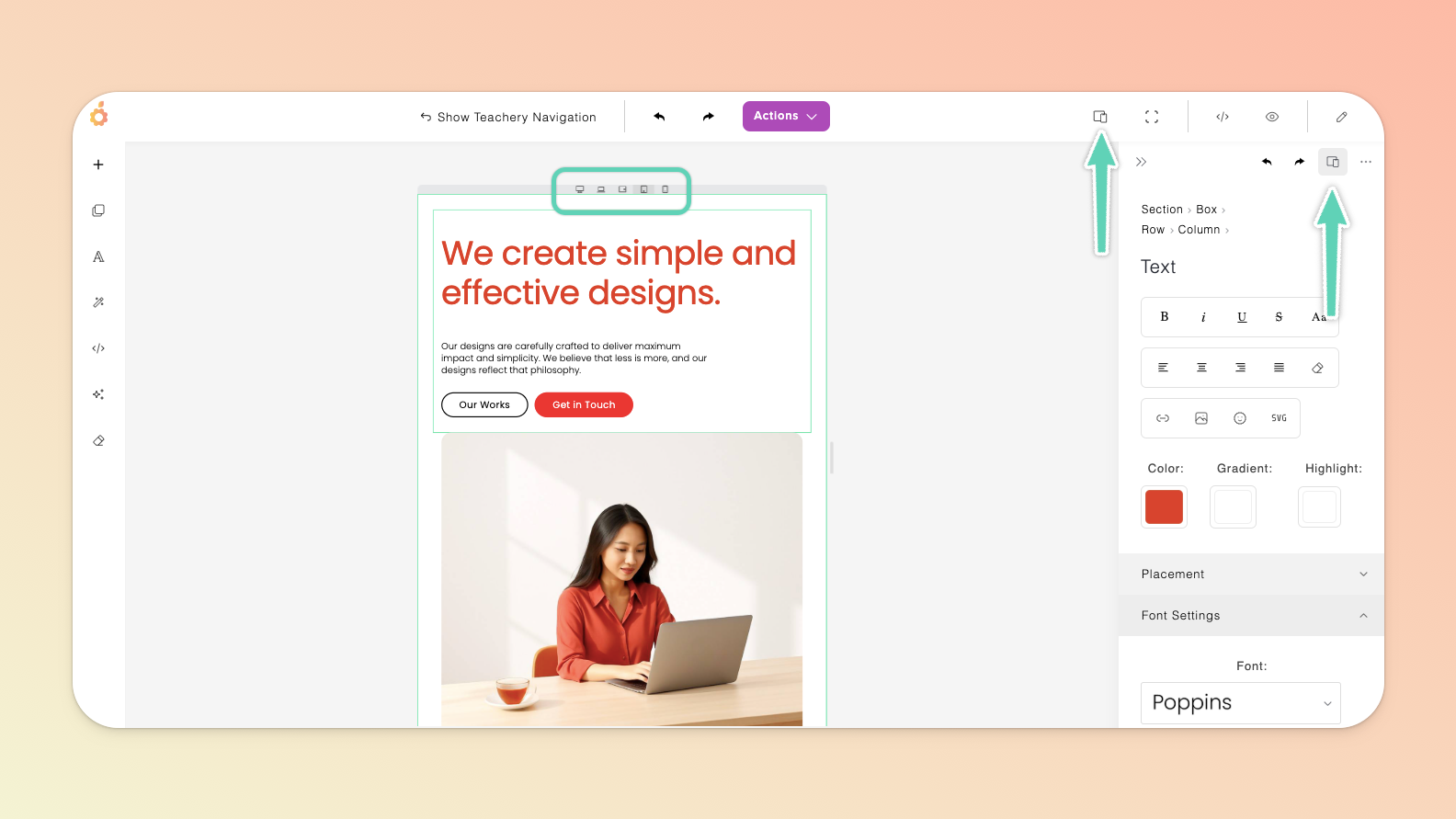
The edit/settings panel (on the right) gives you an indication of which element you’re currently editing (in this case, the text).
It also enables you to switch to the edit/settings panel of any other element in which the current element sits (by simply clicking on the name of any one of them e.g. you would click Row to edit the row in which the currently highlighted text sits).
You can simply click into any element in order to access its edit/settings panel. If its edit/settings panel doesn’t automatically open (on the right), look for either a 3-dot, wrench, or pencil icon (depending on the element) to access an element’s settings.
Alternatively, you can click the pencil icon in the Page Builder’s top main menu to keep the edit panel open at all times.

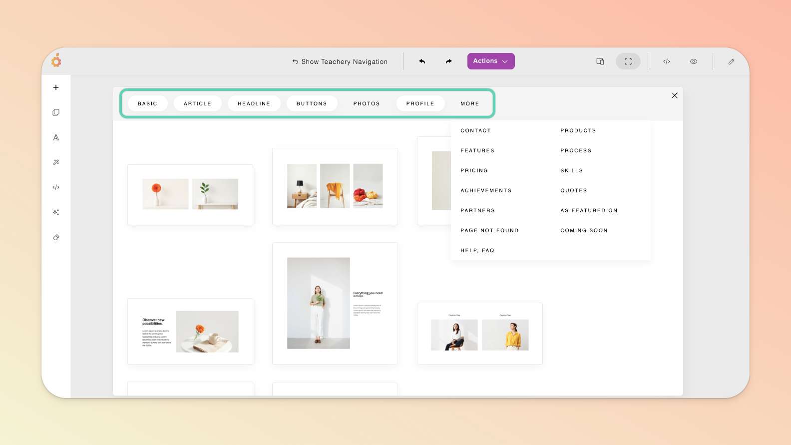
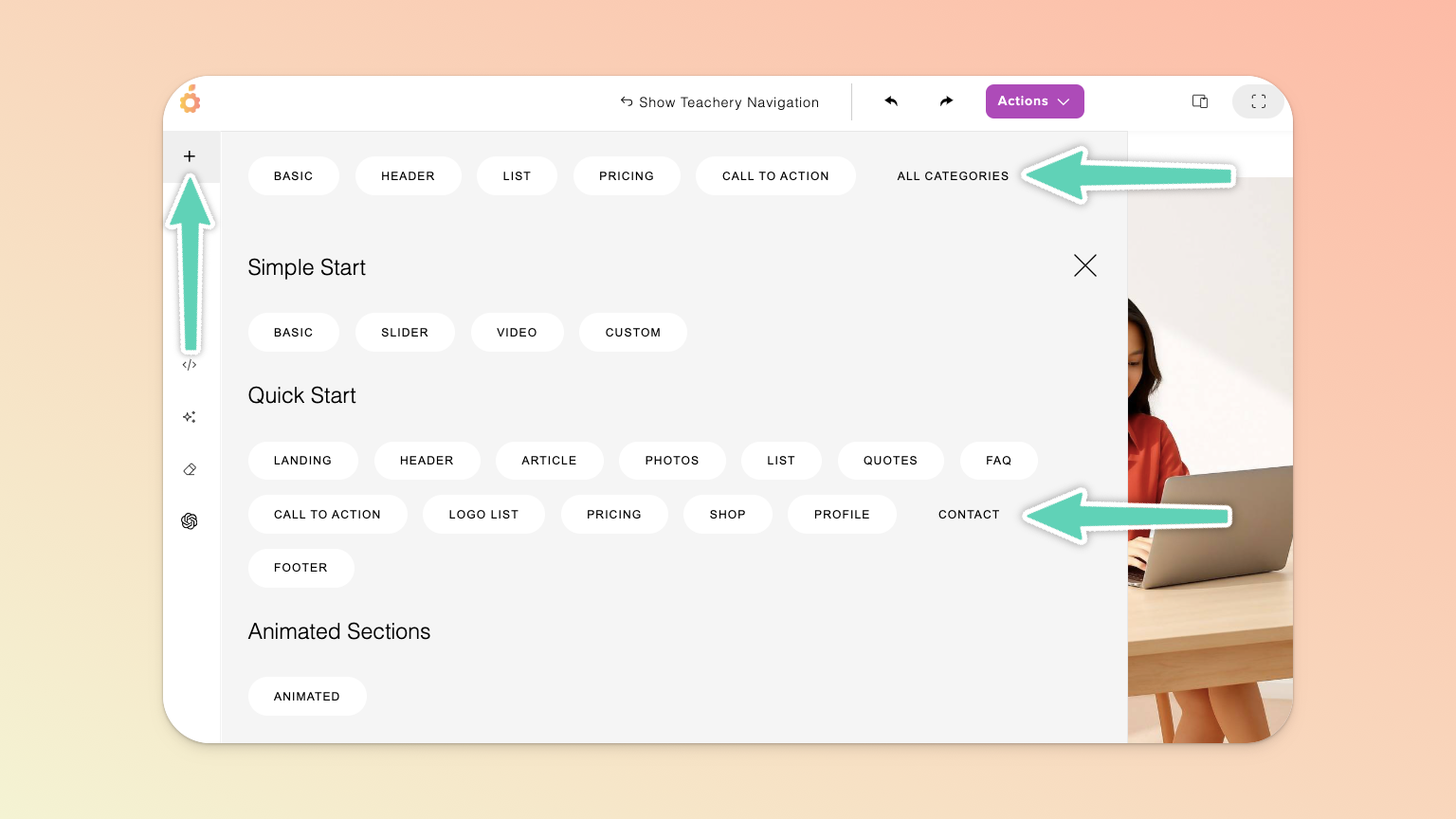
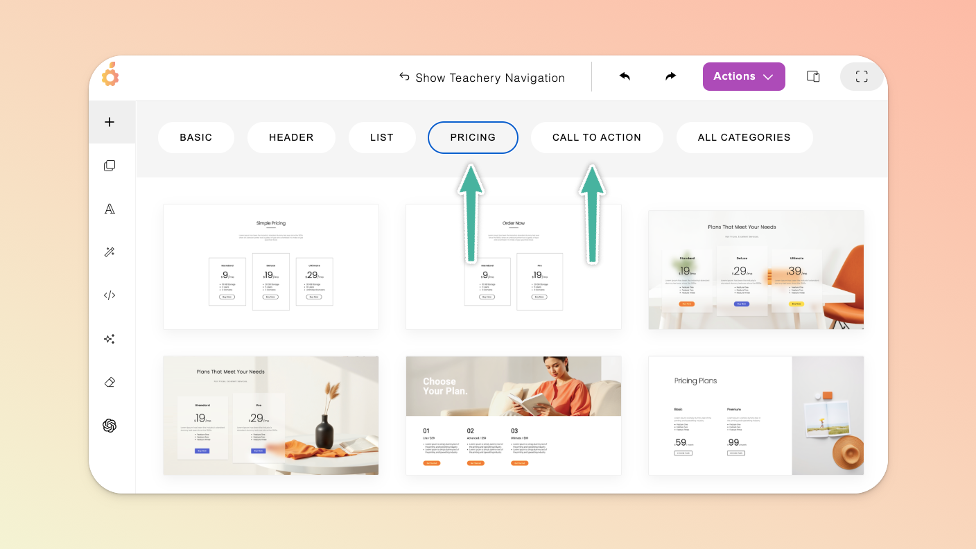
In the Page Builder’s main menu on the left, click the + icon and browse the wide range of sections - from FAQ, pricing, and testimonial sections to background/full-width images or videos, spacers, contact forms, and page dividers.
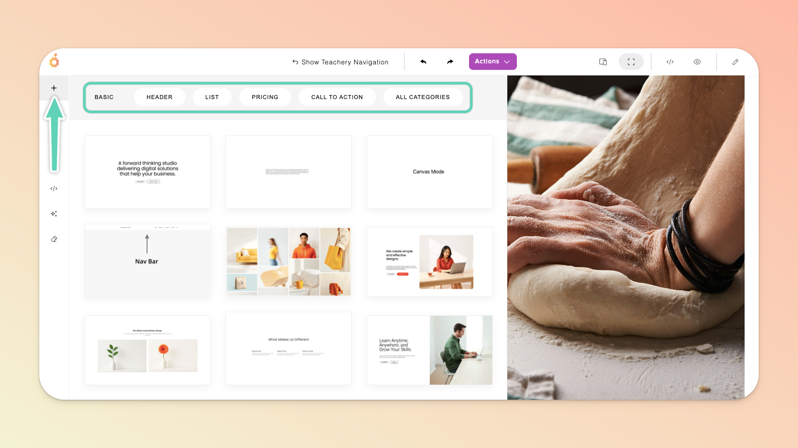
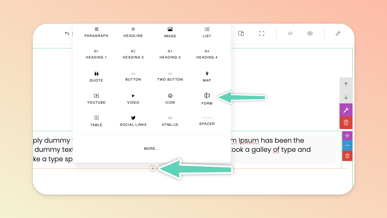
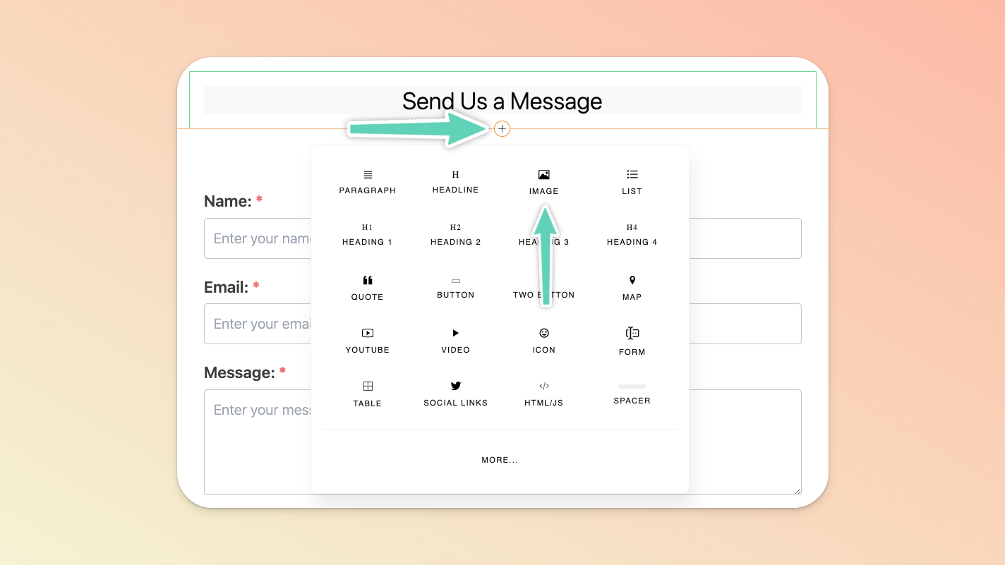
Once you have at least one section, you can also just continue to use the inline + icon that appears below an existing element you have selected to add more elements. To add more elements to the left or right of an existing element, click the + icon at the top of the element.
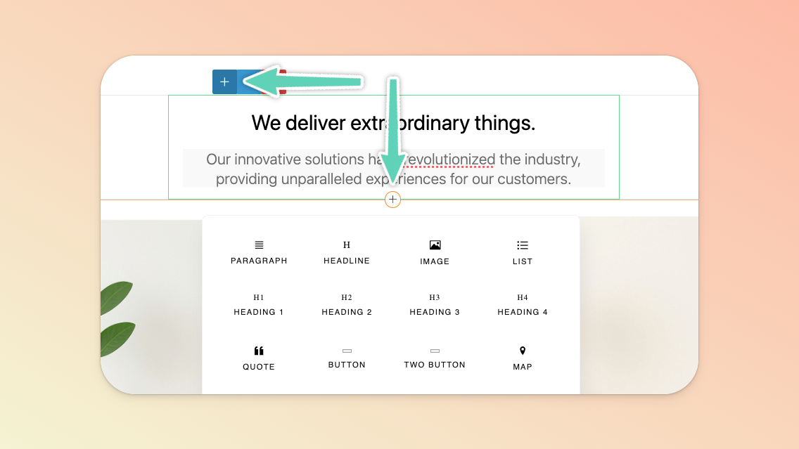
In both instances, clicking More within the menu that appears after clicking the + icon will offer you even more options.
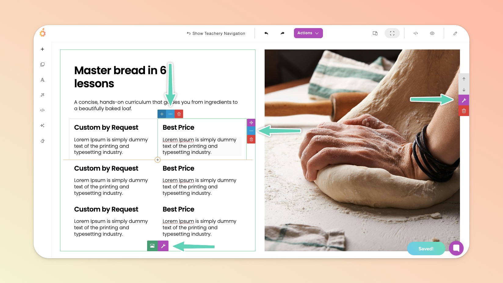
You can also easily duplicate an existing element (and move it up or down to where it needs to be) by selecting the element and clicking its edit/settings icon.
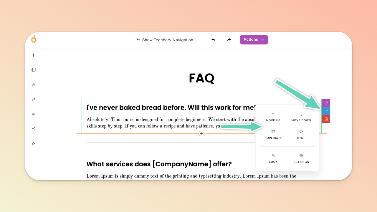
To duplicate an entire section, ensure you have the whole section selected, click the wrench icon to open the edit/settings panel and click the duplicate icon. You can then move/reorder the section using the arrow icons visible above the wrench icon.
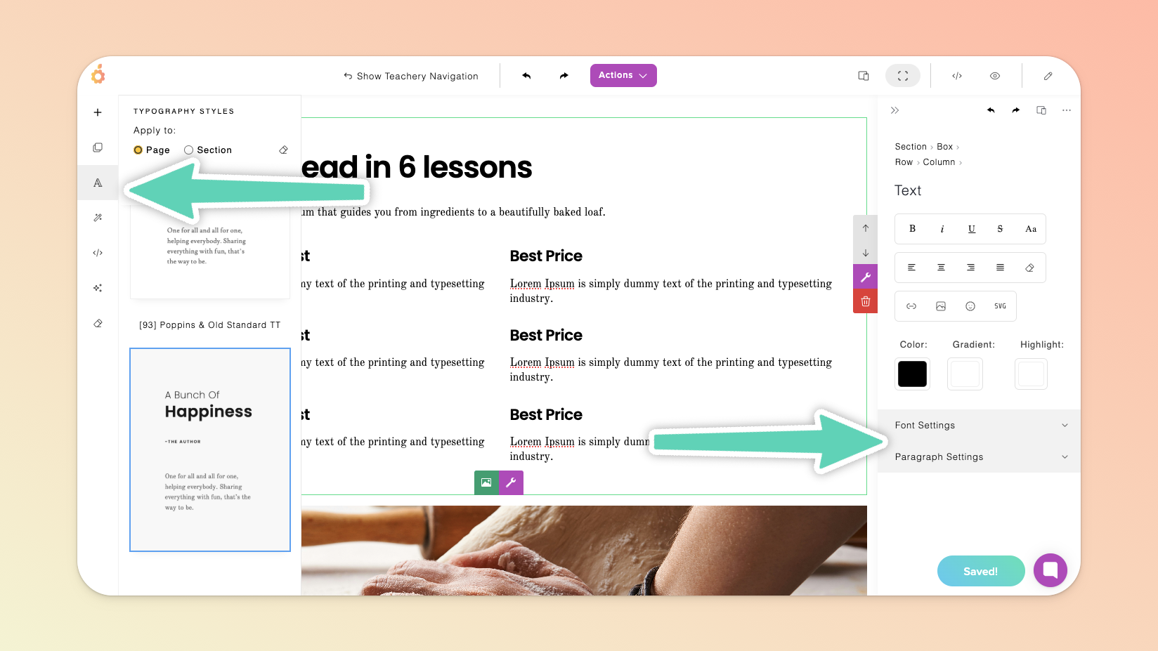
We recommend you build out your full page, insert all your copy/text and then apply your preferred two-font typography style to the entire page (click the “A” icon in the Page Builder’s left main menu to open the Typography Styles panel and ensure the “Page” option is selected).
Using those out-of-the box styles is optional and useful if you’re seeking a quick, simple solution for font styling.
If you prefer, you can instead set your font styles, spacing, sizing etc. section-by-section and within the individual elements (text boxes) themselves, via their individual Font Settings and Paragraph Settings. We recommend checking how these look on different devices (see the Responsiveness section of this page) and refining the settings for each device.
Note that the color palette you’ve defined within your course’s style editor will not apply to a page built with the Page Builder. You’ll need to define your colors from within your newly-built page itself. You can select, for example, a line of text and then define its color within the settings panel (but note that it’s not yet possible to apply color changes globally throughout your page so you need to individually change, for example, each heading’s color).
The color picker/setting uses rgba by default but you can still use hex codes (e.g. #ff0000). Simply paste the code into the provided field, press enter, and it will simply convert to the rgba equivalent.

In the Page Builder’s main menu on the left, click the + icon and in the Basic section, you will find a navigation bar section that you can insert at the very top of your page.
To make changes to the menu items in your navigation bar, select the bar, click its gear icon, and in the popup that appears select the Menu Builder tab.
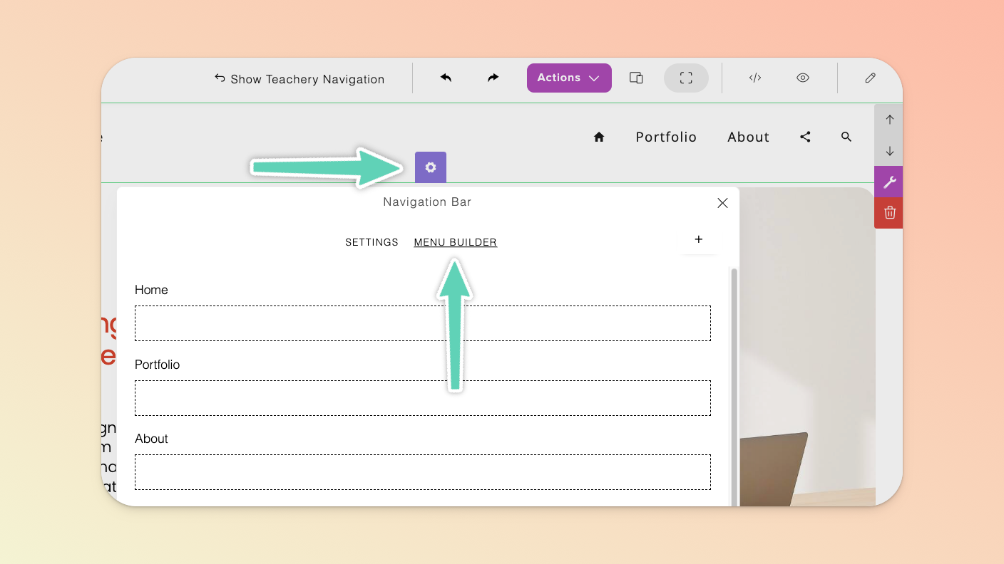
To add new menu items, click the + icon at the top right of the popup (or click the +Search button at the bottom of the popup and then click into that menu item to modify it as needed).
To edit/delete any existing menu items, click on the name of the menu item to open it’s edit popup.
To link a menu item to a section of your page, open the edit popup for the menu item, and click the Goto button beside the Link field, select the section you’re wanting to link to, and then click the Update button to save your changes.
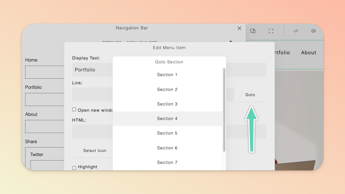
Another way to link to a section (or specific element) of your page from the navigation bar (or from any other piece of content on your page, for example, a button i.e. create an “anchor link”) is to scroll to the target section or element, select it, and open its edit panel. Scroll down to the More options and insert a useful, relevant label in the Add ID field of this target area and allow your changes to auto-save.
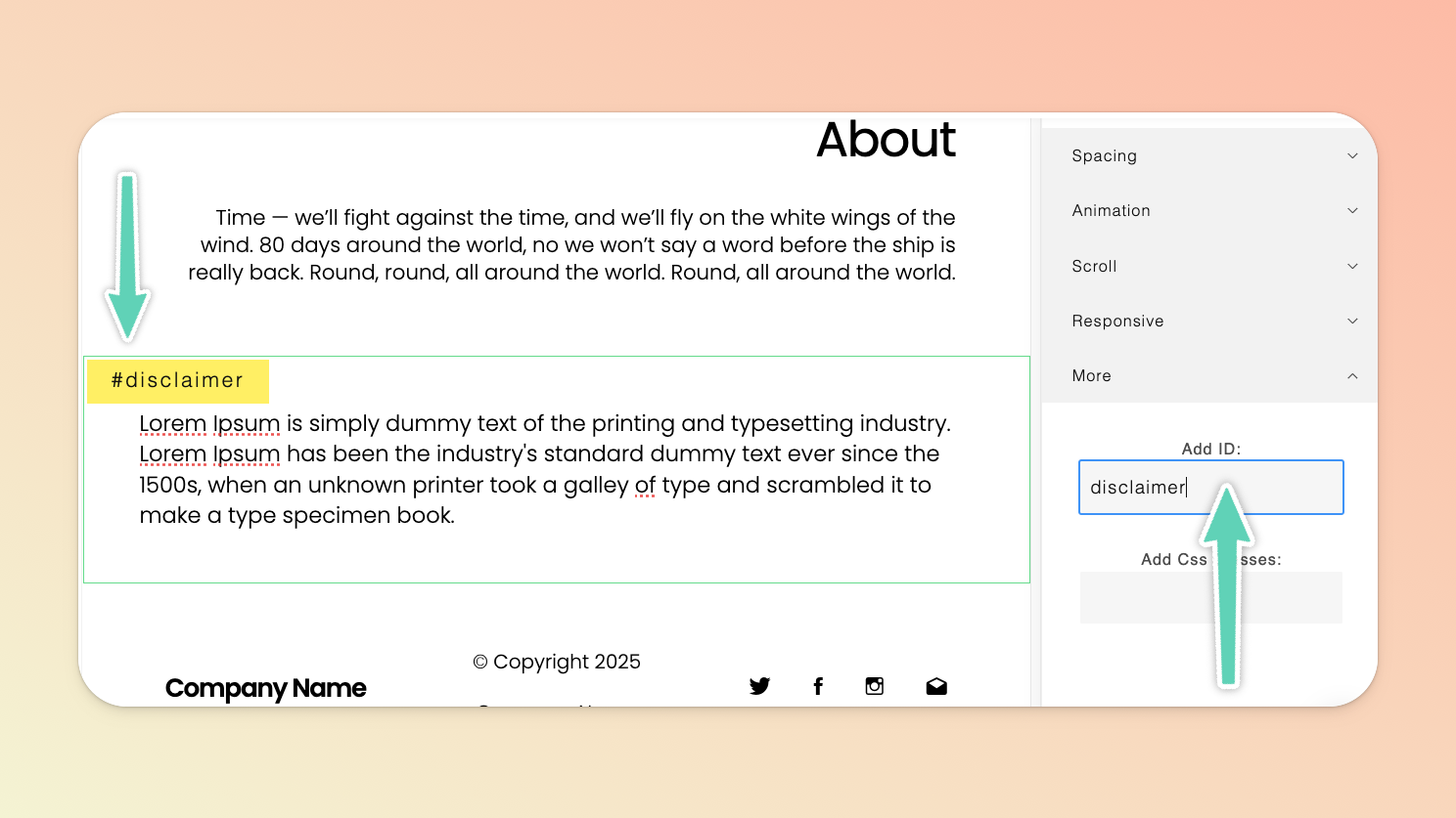
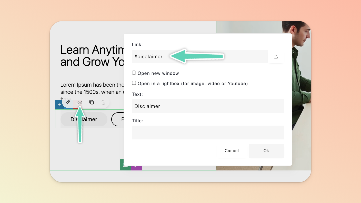
Return to the menu item or button or text you want to hyperlink and, in the Link field, insert # followed by the label you just set and click Ok save your changes.
(Side-note: If you’re wanting to link to another page altogether, simply insert the page’s full URL into the Link field, select whether you want it to open in a new window or not, and click Ok.)
Now when someone clicks your menu item or button, they will jump directly to the relevant section of your landing page.
To capture email addresses and messages from users, you can make use of a Contact section or Form element. Also refer to the Connect an Email Provider section of this help doc.
To modify the form’s text and styling, select the form and click the gear icon within it or, if the edit panel is open, the Configure button.
The data that is collected by the form will be captured in and downloadable from the Email Leads page. Access this page from the Actions menu of your landing page.
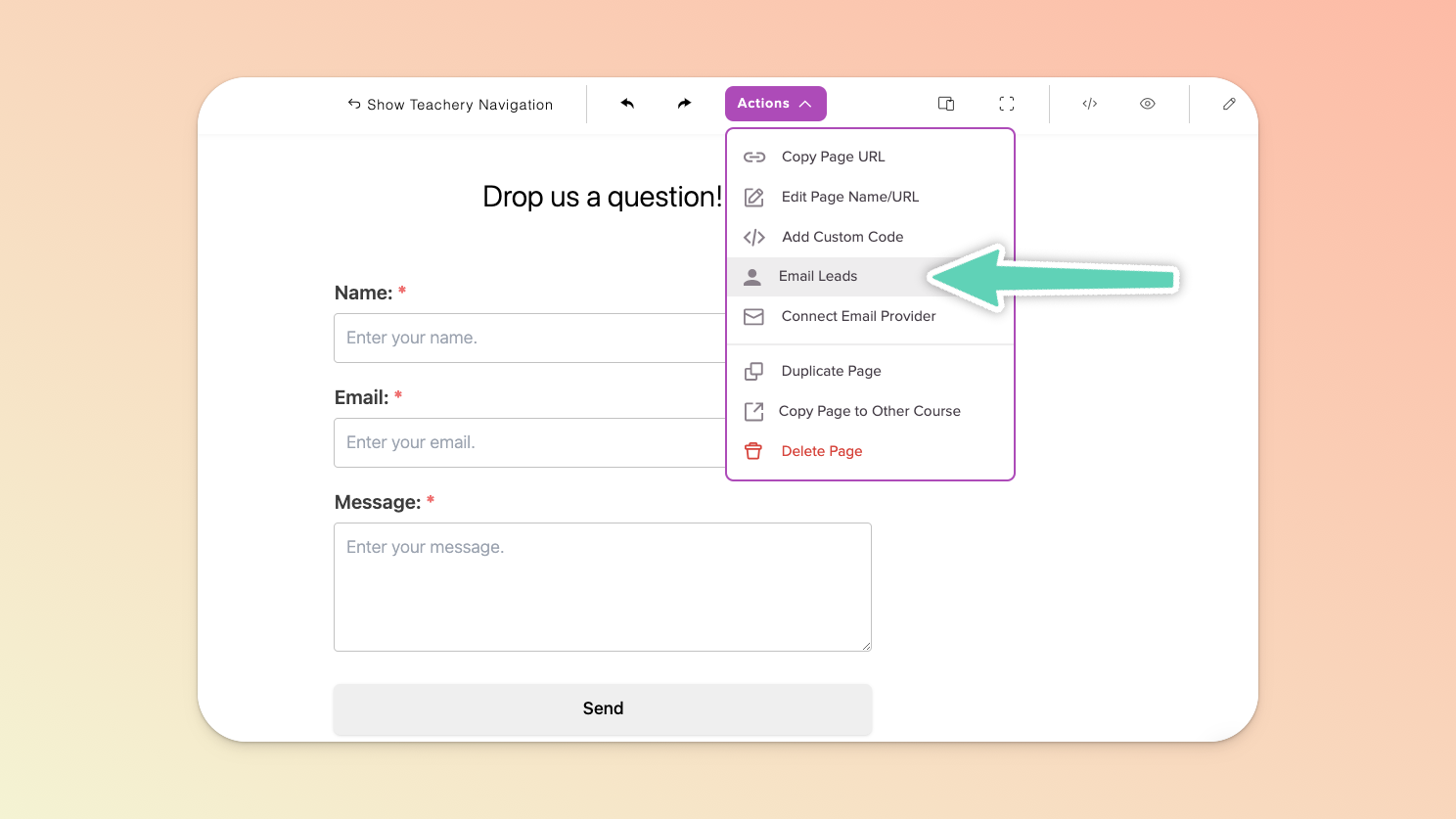
If you want the email addresses you’ve captured to automatically be added to your Mailchimp, Kit, Flodesk, or Mailerlite account, make sure to click the Connect Email Provider button in the Actions menu. Then simply follow the instructions in the corresponding help doc. Refer to the Contact Forms section of this help doc too.
To direct users to your payment/checkout page(s), you need to insert a call-to-action (e.g. a content block with a button) and then copy the URL of the payment page you want to direct people to and hyperlink the button with that URL. If you make use of affiliates, please jump to the Affiliates section of this help doc.
There are out-of-the-box content blocks that can make your life easier. Browse the options available under Pricing or Call to Action.
Images can be added either as background elements or standard, inline elements (much like how you would add a text box or button, etc.) - it depends on how you want to use an image.
There are two ways to add an inline image: either add an entirely new section that already includes an image element (click the + icon in the Page Builder’s left main menu to find a section you like) or click the + icon of an existing element in your content (e.g. a text box) and select the Image element option (pictured below).
In either case, simply replace the default image by selecting that image and clicking the file manager (folder) icon (either from directly in the image or via its edit/settings panel on the right of the page). Once in the file manager, import a new image from your computer or select one already in your file manager and click Select.
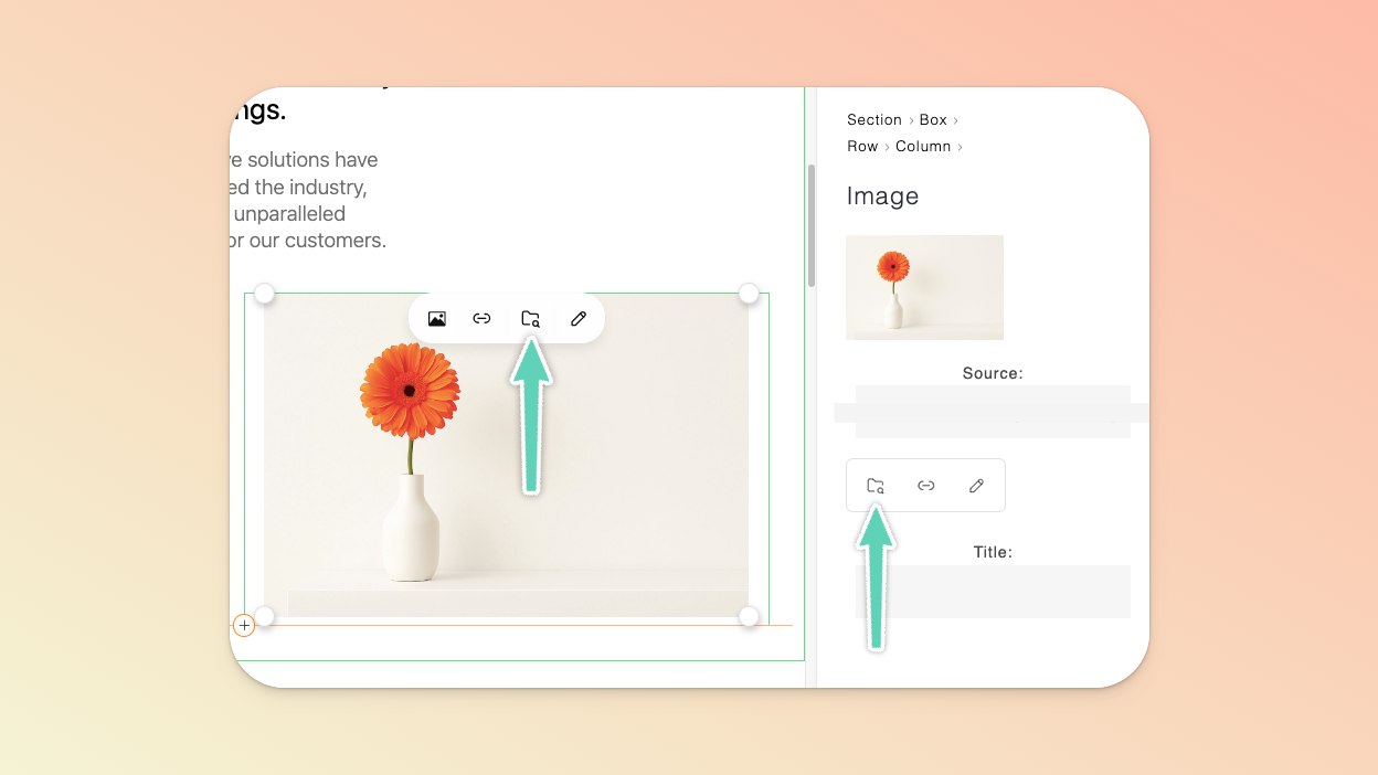
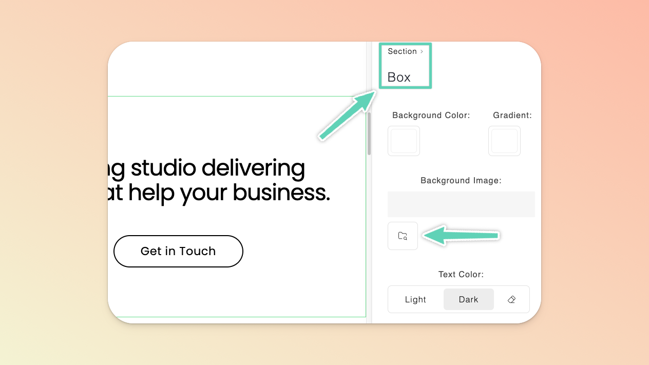
Adding background images is easy as most section types will enable you to set a background image (as opposed to videos which can only be uploaded to a particular type of section). Simply select the box element of the relevant section (you can do so by selecting a smaller element within the section and then clicking Box in the “breadcrumb” visible in the edit/setting panel on the right of the screen). Once there, click the file manager (folder) icon to find the image you need.
Like images, videos can be added either as background elements or standard, inline elements - it depends on how you want to use a video.
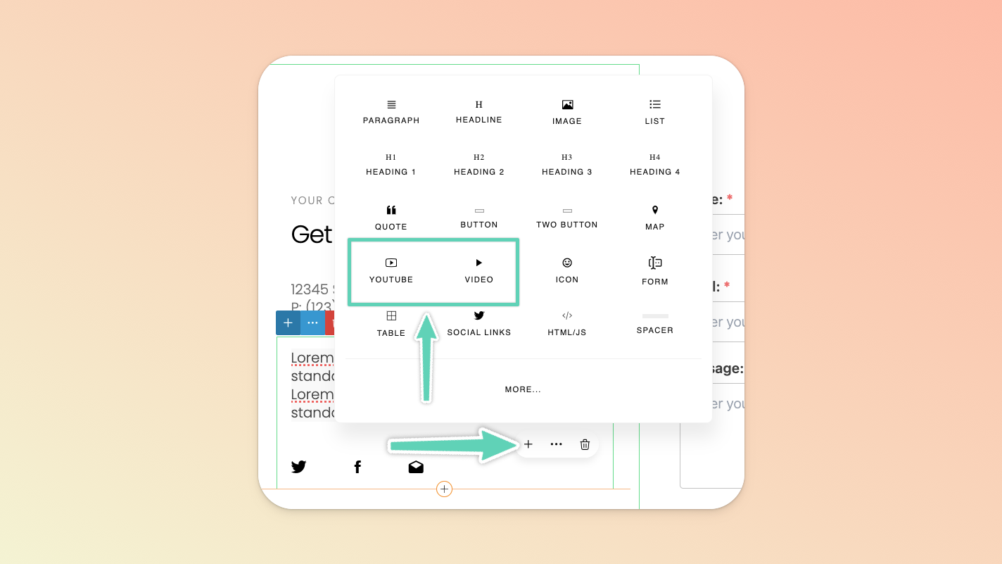
There are two ways to add an inline video: either add an entirely new section that already includes an inline Video element (click the + icon in the Page Builder’s left main menu to find a section you like) or click the + icon of an existing element in your content (e.g. a text box) and select the Video or Youtube element option (pictured below).
If you’re wanting to embed a Youtube or Vimeo video (>50MB in size)), choose the Youtube element. Click the default video and replace its URL with your video’s URL in the provided field.
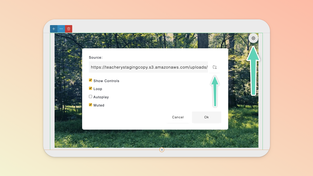
Alternatively, you can use the standard Video element to upload a video. Given we limit the file size to 50MB, this is only suitable for videos you may want to use as a design element or the like.
Simply replace the default video by selecting that video, clicking the gear icon to open its settings and then clicking the file manager (folder) icon. Once in the file manager, import a new video from your computer or select one already in your file manager and click Select.
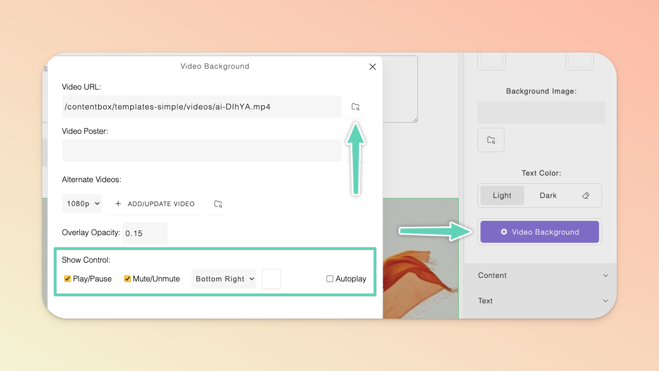
To add a background video, go to the Page Builder’s left main menu, click the + icon, then select All Categories and then Video - you’ll find various sections (with background videos) to choose from. Once you’ve added a section, select it and open either the section’s or the video’s settings directly.
From here you can replace the default video via the file manager as well as manage other settings e.g. autoplay.
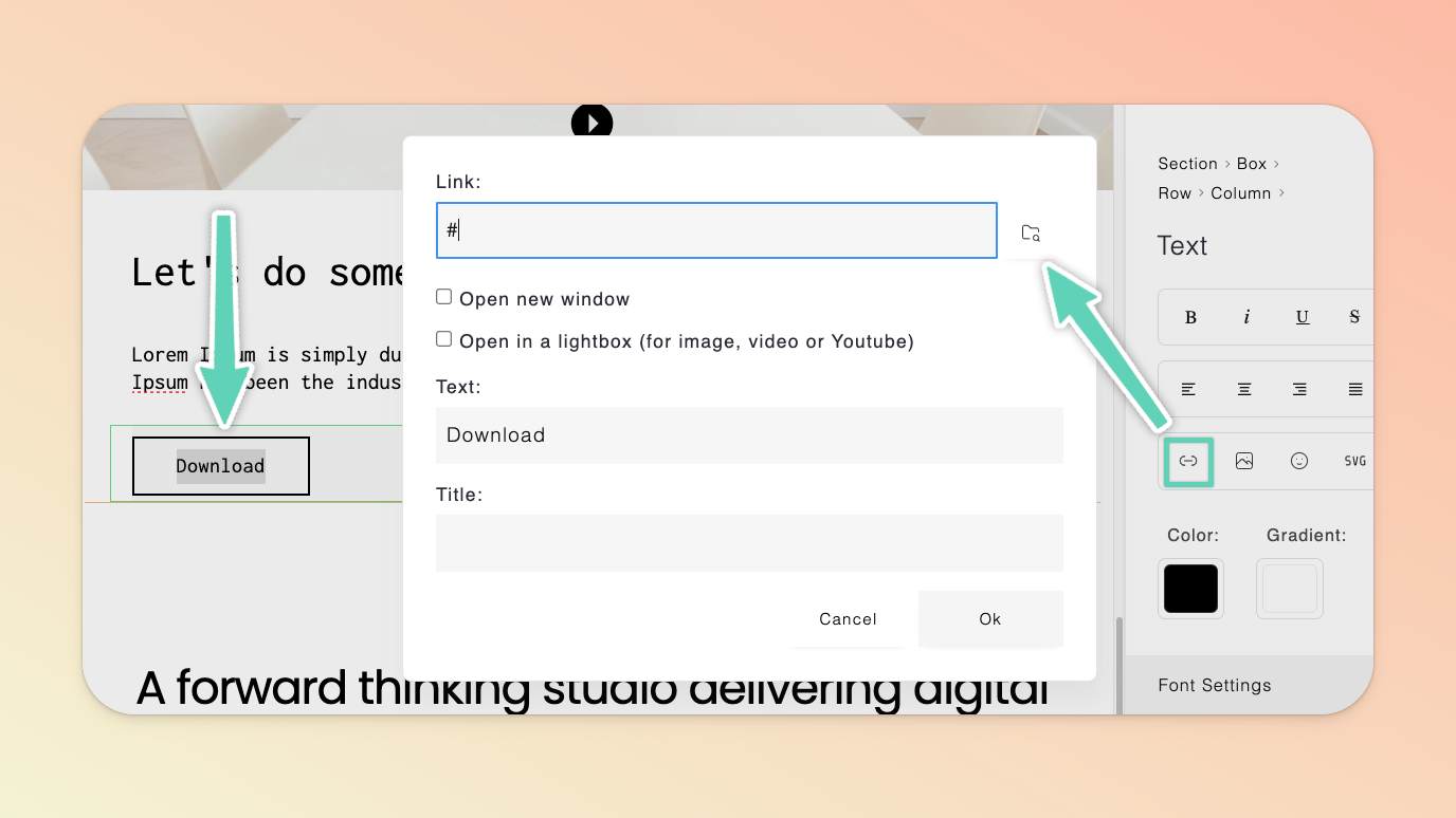
You can also add files you may want your users to download e.g. a .pdf ebook.
Highlight the text element you want your downloadable file linked to and click the link icon in the edit/settings panel. In the window that opens, click the file manager (folder) icon. Once in the file manager, import a new file from your computer or select one already in your file manager and click Select.
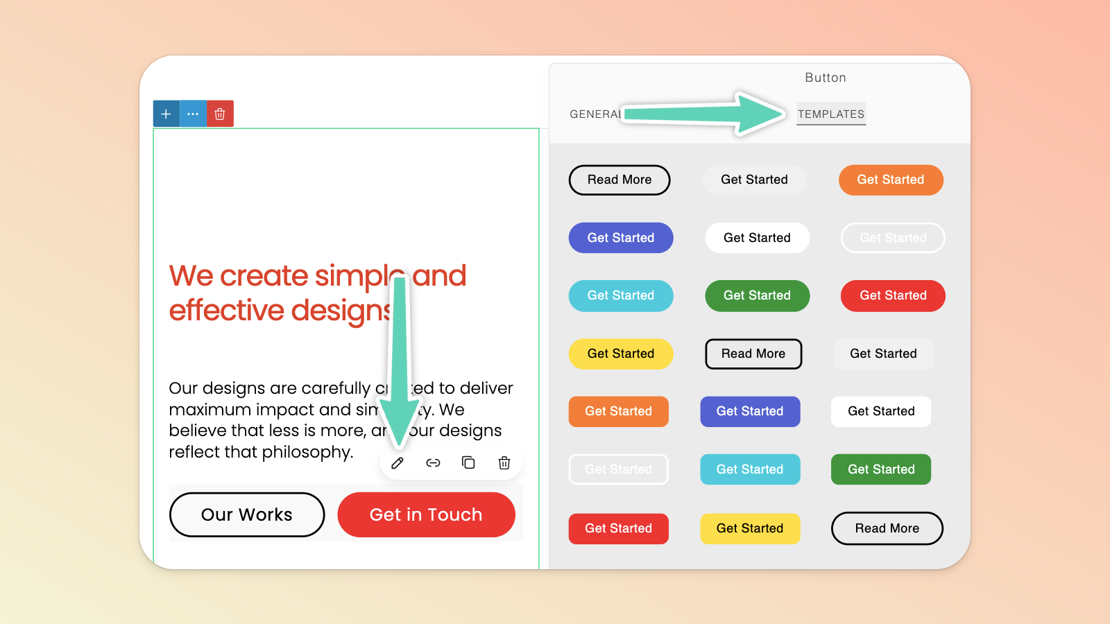
To edit a button, you need to ensure you have the button itself selected and look for the pencil icon to open its unique edit/settings panel; which has an extensive list of configurations e.g. hover colors, padding, and rounding of corners.
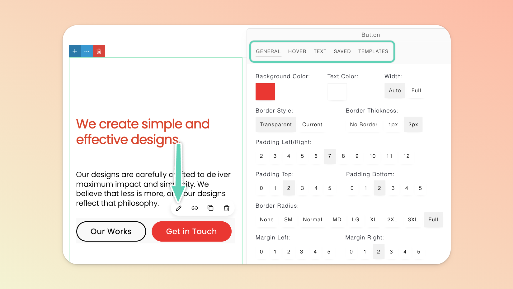
There are a range of template button styles you can use right “out of the box” or as a starting point. These are available in the Templates tab of the edit/settings panel. With your button selected, simply click on your preferred button style and the change will be applied.
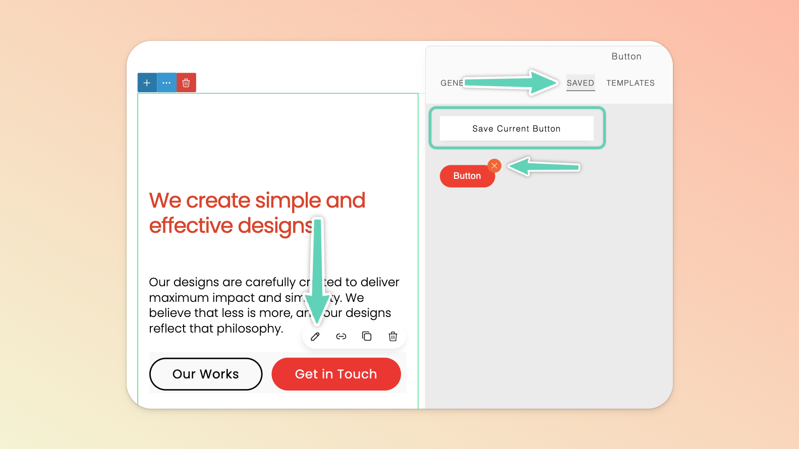
You can save any button styles you create in the Saved tab of the edit/settings panel. To apply a saved style, return to the Saved tab and click the style you wish to apply (it’s here you can also delete any saved styles, by clicking the “X” that appears on hover).
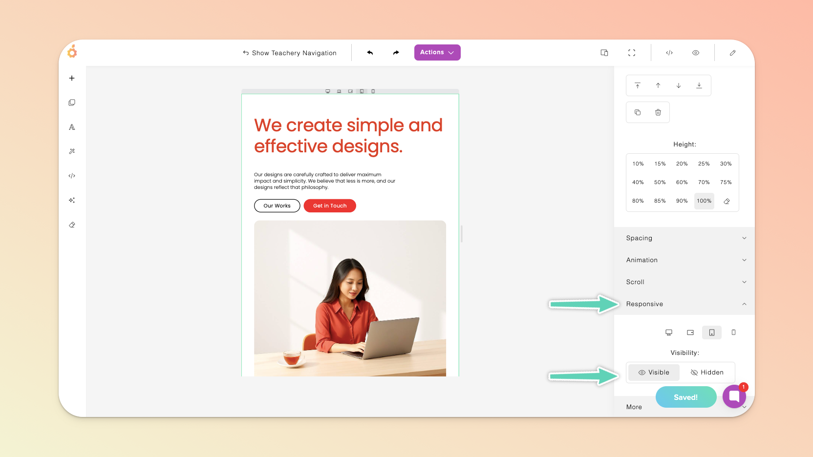
We recommend toggling between different views to see how your page will appear on different devices (e.g. on a computer versus a tablet versus a phone) and then styling each view so that the page looks its best on any device. Try take a mobile-first approach, that is: lay out, style, and see how things look on smaller devices and then slowly move through the bigger device sizes.
You can do this by using the Toggle Device icon available from the Page Builder’s top main menu or from within a section’s or element’s edit/settings panel. Use the small five icons that appear at the top of your page (below the Page Builder’s top main menu) to switch between device types. To close this “Toggle Device” view and return to the default view, click the Full View icon in the Page Builder’s top main menu (to the right of the Toggle Device icon).
There are a certain elements that you can edit in different device views that will apply ONLY in those responsive device views:
✅ Font size, content size, grid settings, and visibility.
❌ However, image sizing and positioning are NOT supported as responsive-specific options.
The visibility setting in particular enables you to hide an element/section on certain devices. Simply select the relevant element or section and modify the Visibility in the Responsive settings.
With limited space on mobile, you may want to reconfigure how grids appear. A grid is essentially any row of content made up of multiple columns (even if those columns are empty). Click into the element, ensure you select the Row in the side panel’s “breadcrumb” and then reduce the number of columns “per line” in the Grid Settings.
Much like how you add affiliates to payment pages or our traditional fixed-template landing pages, you can apply the same principles to any page you build with our new Page Builder.
If you have calls-to-action/buttons on your new page that you wish to direct to a payment page(s) and be able to successfully track your affiliates’ referrals, you simply need to copy your default/plain payment page’s URL (i.e. it should have no affiliate’s referral code appended to it) into the settings of your call-to-action/button.
When someone uses an affiliate’s dedicated link for the landing page you’ve built, the call-to-action’s/button’s URLs will automatically adopt and carry over the affiliate’s referral code, successfully tracking any sale that is made (you can see similar mechanics in action in this video at timestamp 02:20).