We heard you (and agree) that our original Landing Page Template (which will eventually be decommissioned in late 2026) does not quite compete with others’ out there. We’ve been working hard at a solution and have just released a more powerful Page Builder for you to use! ✨


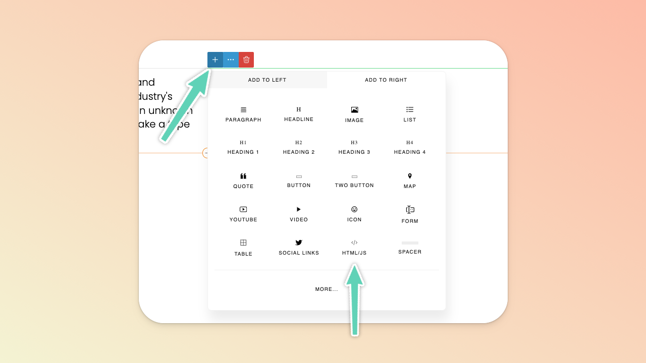
To embed content with either iframe or more complex code (e.g. script/header code provided by the third-party platform you’re using), click the element beside which you want to add the embedded content and add an HTML/JS element.
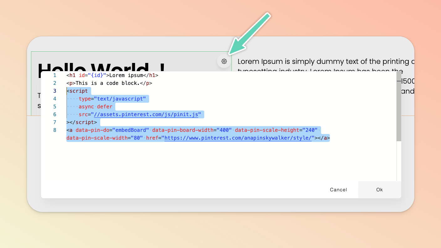
Click the gear icon of the element you just added and replace the placeholder text with your embed code. If the third party platform has provided you with script/head tag/header code, you need to pop it in here too, above/before the “inline” embed code itself. For example, pictured below is the full script and inline embed code for a Pinterest board.
You can insert your own HTML (and CSS) at page level or element level. Either select the HTML/code view icon from the Page Builder’s left main menu or top main menu. If you’re editing a particular element, click the element’s edit/settings icon and then select the HTML/code view icon in the menu that appears.
Adding Google fonts in the page builder works a little differently to Teachery courses. We’re still refining this particular functionality of the page builder but, in the meantime, you can still introduce your own fonts (whether a Google or uploaded custom font) by inserting custom CSS in your page’s HTML code editor.
Get the embed code you need.
In the page builder, open up the HTML editor and at the very bottom paste in the Google embed code.
Determine to which elements you want to apply the font and write up custom CSS to drop in below the Google embed code.
<link rel="preconnect" href="https://fonts.gstatic.com">
<link href="https://fonts.googleapis.com/css2?family=Ultra&display=swap"
rel="stylesheet">
<style>
h1.mycustomclass {
font-family: Ultra !important;
}
</style>
Much like Google fonts, adding custom fonts in the page builder works a little differently to Teachery courses. We’re still refining this particular functionality of the page builder but, in the meantime, you can still introduce your own fonts (whether a Google or uploaded custom font) by inserting custom CSS in your page’s HTML code editor.
Upload your font file(s) to Teachery via the file manager (as you would an image or file) and then copy the file’s URL (you don’t need to insert the file into your content, just upload it to your file manager).
In the page builder, open up the HTML editor and at the very bottom paste in code to introduce the custom font. Using the sample provided below: replace My Custom Font with your own font name, replace the URL link with the file link you copied in the initial step, and replace the format with the format of your font file.
<style>
    @font-face {
        font-family: "My Custom Font";
        src: url("https://uploads.teachery.co/uploads/files_manager/xxx.woff")
        format("woff");
    }
</style>
Determine to which elements you want to apply the font and write up custom CSS to drop in below the custom font code. The final product will look something like this:
<style>
    @font-face {
        font-family: "My Custom Font";
        src: url("https://uploads.teachery.co/uploads/files_manager/xxx.woff")
        format("woff");
    }

    h1.mycustomclass {
        font-family: "My Custom Font" !important;
    }
</style>
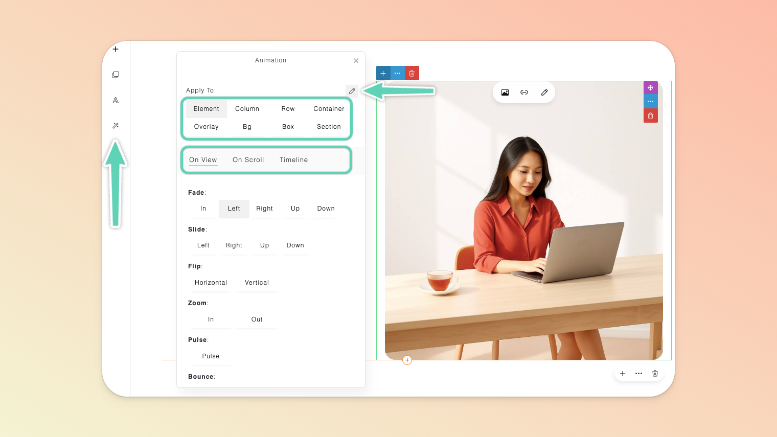
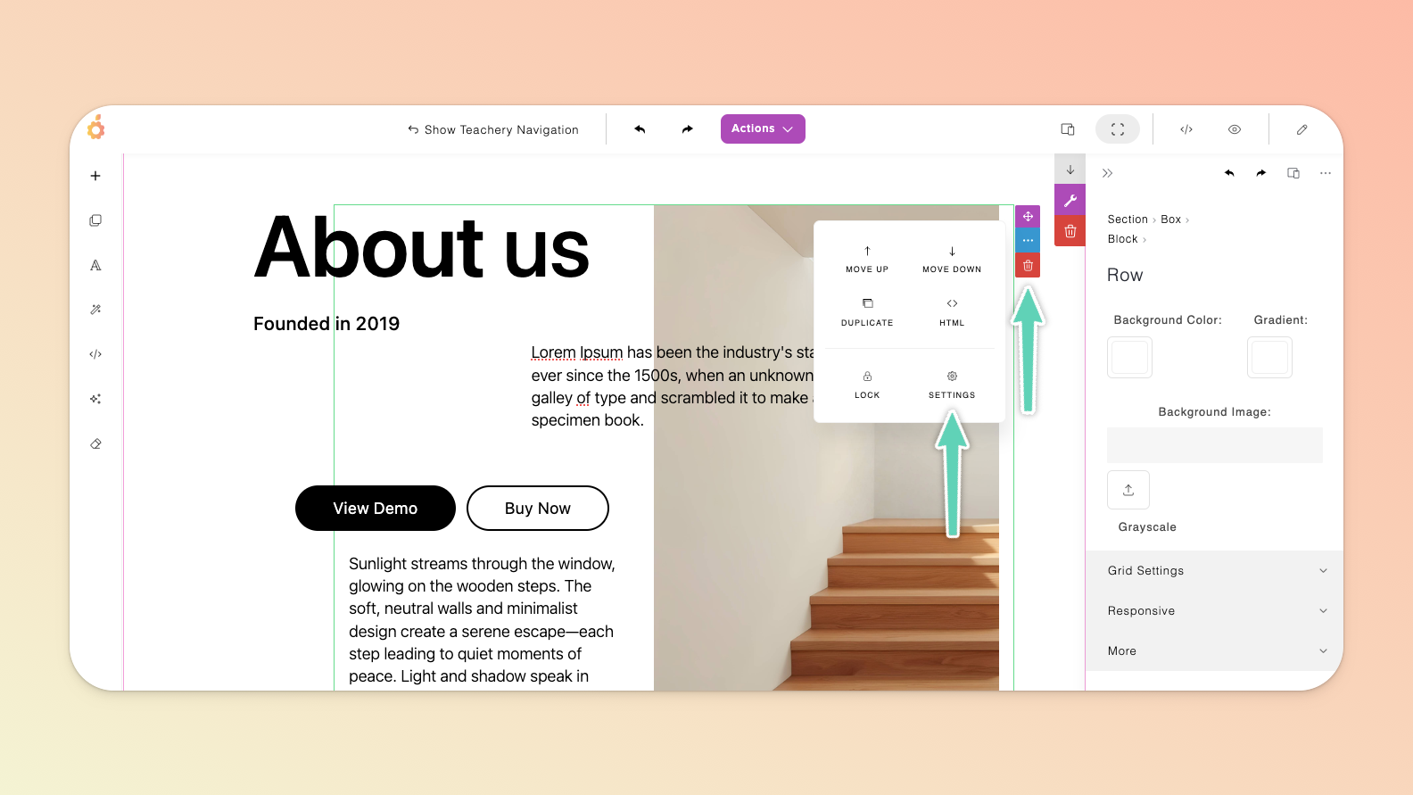
Click into the area of the section you want to animate and then click the magic wand/animation icon in the Page Builder’s left main menu.
Click the pencil/edit icon in the panel that appears and then confirm you’ve selected:
the relevant element/content block you want to animate (e.g. the column holding an image or the entire section itself),
the trigger for the animation (e.g. a click), and
the animation itself (e.g. a fade in).
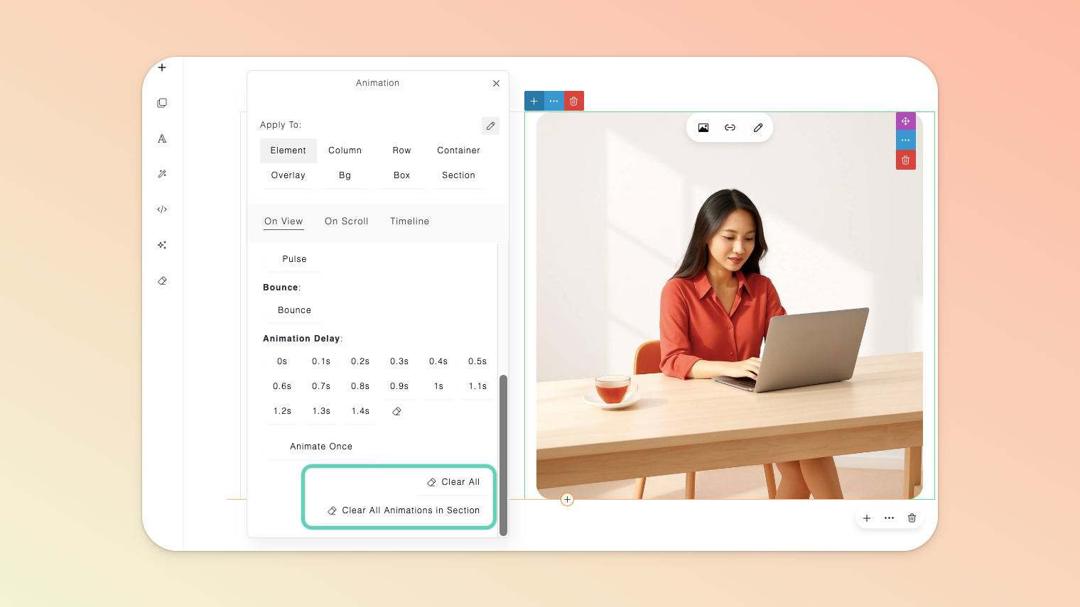
Click the eye/preview icon in the Page Builder’s top main menu to test the animations.
To clear all animations from the entire page or just the selected section, use the Clear All or Clear All Animations in Sections button available at the very bottom of the animations panel.
With the use of prompts, you can have AI assist you in adding new custom sections, making visual/style changes, and drafting copy/text.
If you don’t already have an API key, visit the OpenAI website, and create an account or log in.
OpenAI now requires that you verify your identity in order to generate images. Visit the Verification section of this page to complete the process. Note that it can take up to 15 minutes for your verification to take affect.
While you wait, fund your OpenAI account with at least $5. This too is critical for generating images.
On the API Keys page, click the + Create new secret key button. Name your key and grant All permissions and click the Create secret key button. Once your API Key is generated, copy it and save it in a safe place.
Back in the Teachery Page Builder, click the AI Assistant icon in the left sidebar menu and insert your API key and save.
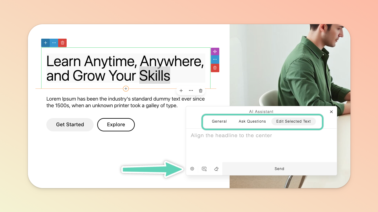
Click the OpenAI icon in the left sidebar menu and, in the AI Assistant panel that appears, you will find three different tabs (a.k.a modes):
General → Used for designing or editing commands.
Ask Questions → Used for commands that are not related to designing and editing.
Edit Selected Text → Allows you to specifically target a selected text element for editing, providing more precise results.
The bottom icons from left to right are:
Settings → Here you can control the randomness/creativity and diversity/relevance of the AI’s generated results. You can also set it so that any time you select a text element, the AI automatically switches to Edit Selected Text mode.
Command Examples → Catalog of command/prompt examples to help you get going. Click on a command and it will appear in the AI Assistant textbox. You can then modify it before clicking “send” to execute it.
Clear → Erases anything in the AI Assistant textbox.
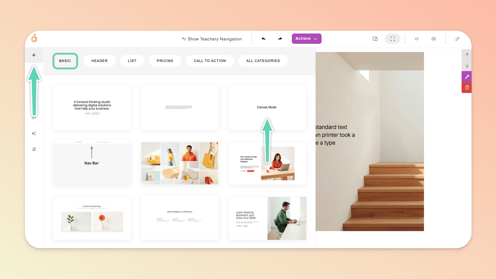
This feature allows you to build out sections in a more freeform way. That is, you can more freely add and drag elements (a.k.a blocks) around as you like. That said, we recommend only more advanced users give it a try.
Essentially, the goal is to drag and resize your elements as you design your page for every device size to ensure it remains responsive and renders well on (most) devices. In the case of Canvas mode, it is actually best to build for “desktop” devices first and then work your way through ever-smaller device views, checking everything is appearing as best it can.
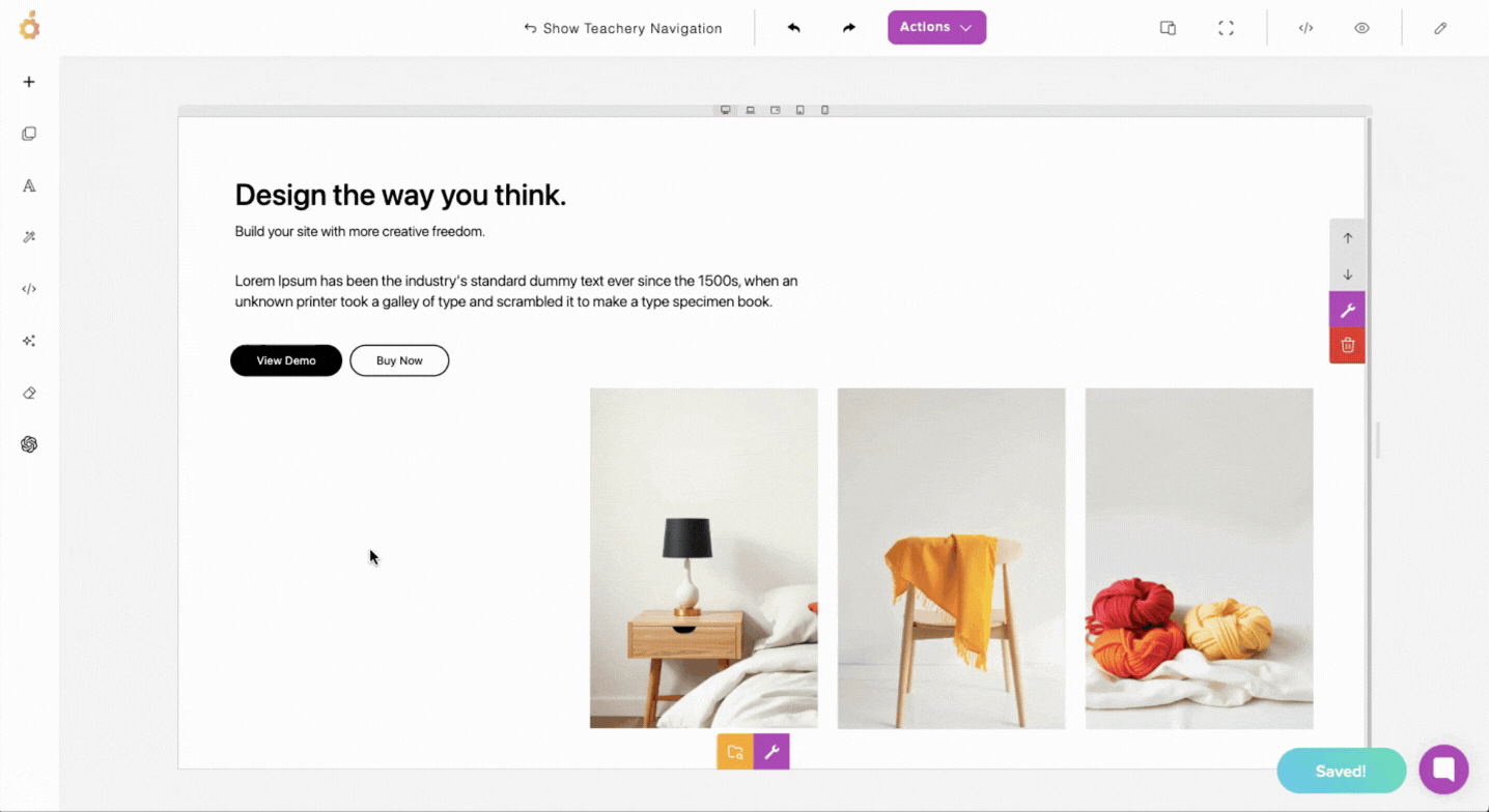
Add a Canvas Mode section (click the + icon in the Page Builder’s left main menu); which is available in the Basic category of sections.
Use the drag-and-drop feature (see the icon below the + icon in the Page Builder’s left main menu) to drop in any elements/blocks you need. (The elements are arranged by category - use the provided dropdown menu in the drag-and-drop panel to find the one you need.) Once dropped, you should be able to drag the elements/blocks around as needed.
Below is a quick demo of how to get setup and start adjusting your content for different devices (by toggling through the different device views). Be sure to check on the results in Preview mode too. Once you get the hang of it, you can even resize your view by dragging the width of your view/canvas either wider or narrower (to cater your content to even more device sizes).
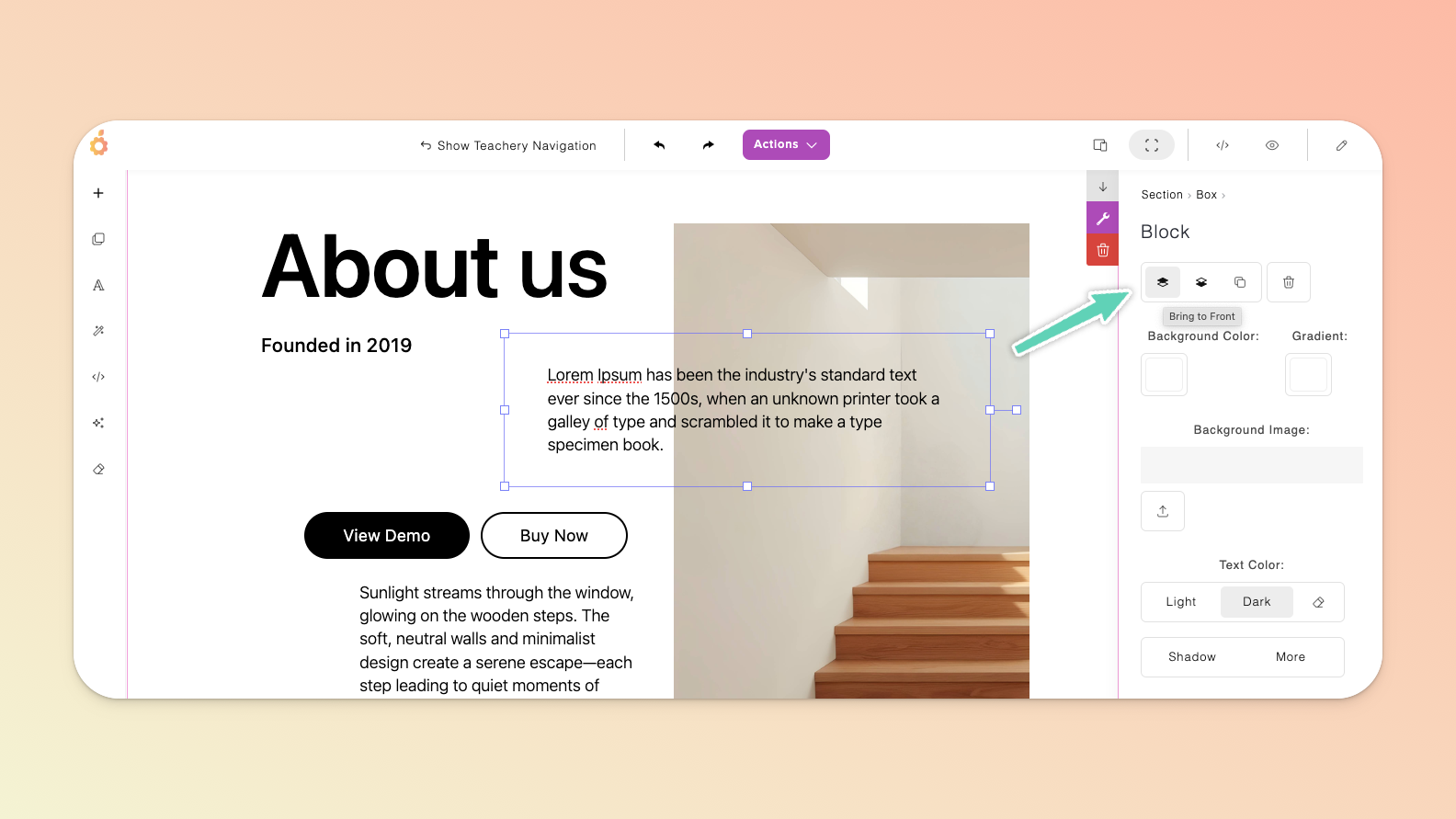
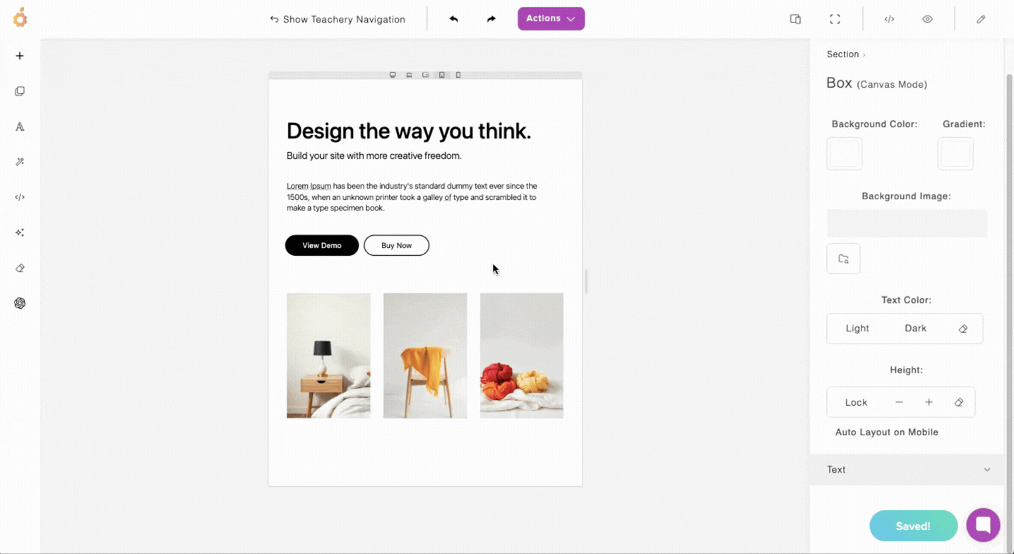
Double-clicking into any element/block will give you the standard edit/settings features that you’re accustomed to in other sections (depicted below).
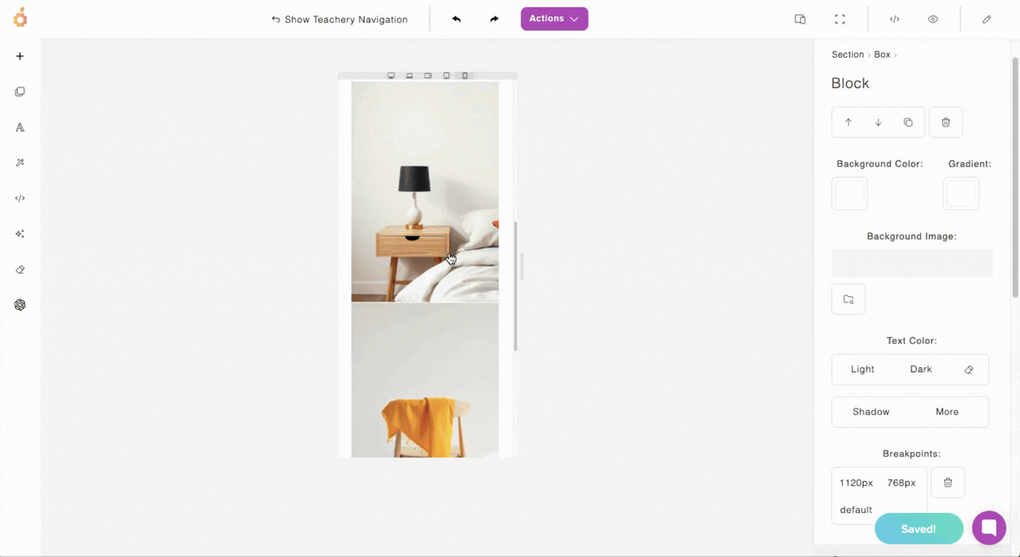
If you’re in standard edit/settings mode and you want to be able to drag and/or resize an element again, simply click out of it (anywhere else on the page) and then click on it once. In this mode, and with the edit panel open, you can also change a few settings including how the different elements/blocks are arranged e.g. overlapping one in front of the other.
You’ll want to adjust font sizes, images sizes, and element/block placement on most device views (below is a demo of how to adjust font sizes).
Mobile view can be tricky - it’s tougher to drag elements around and the page builder has its limits so you may want to keep things simple here.
Again, we recommend keeping the Auto Layout on Mobile feature enabled (available in your Canvas section settings) which will permit the tool to automatically adjust your page for mobile devices. You can disable it however, if you don’t think the result renders well and you’d prefer to manipulate every element/block yourself.
With limited space on mobile, you may want to reconfigure how images/grids appear and may even want to hide some elements (demonstrated below).
💬 Hit a hurdle or built something you’re proud of? Share it with us via the chat support bubble!