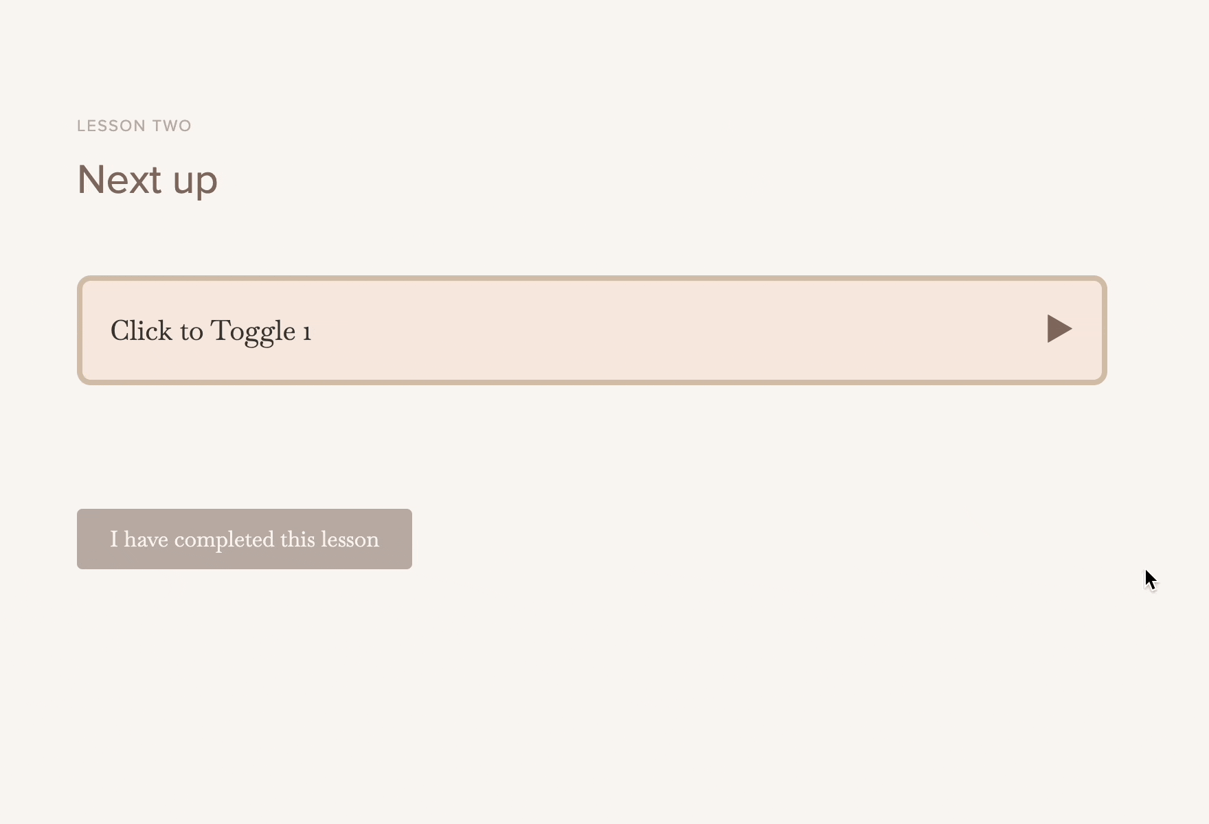
Having a transcript of lesson text is great for accessibility! But, it can be not so great for the overall experience in a lesson if a customer has to scroll, scroll, scroll to get to the bottom of a lesson to continue on.
Because Teachery allows you to add custom code, CSS, and HTML, you can easily add a collapsible toggle that functions like this:

You'll need to navigate to the Course Settings > Manage Options page and in the Head Tag Code Injection area you'll paste in the Javascript.
Here's the script code to add (make sure to click the Save Options button after adding it):
<script>
document.addEventListener('DOMContentLoaded', function() {
    const accordionToggles = document.querySelectorAll('.accordion-toggle');

    accordionToggles.forEach(function(toggle) {
        toggle.addEventListener('click', function() {
            const accordionContent = toggle.nextElementSibling;
            toggle.classList.toggle('active');
            accordionContent.classList.toggle('open');
        });
    });
});
</script>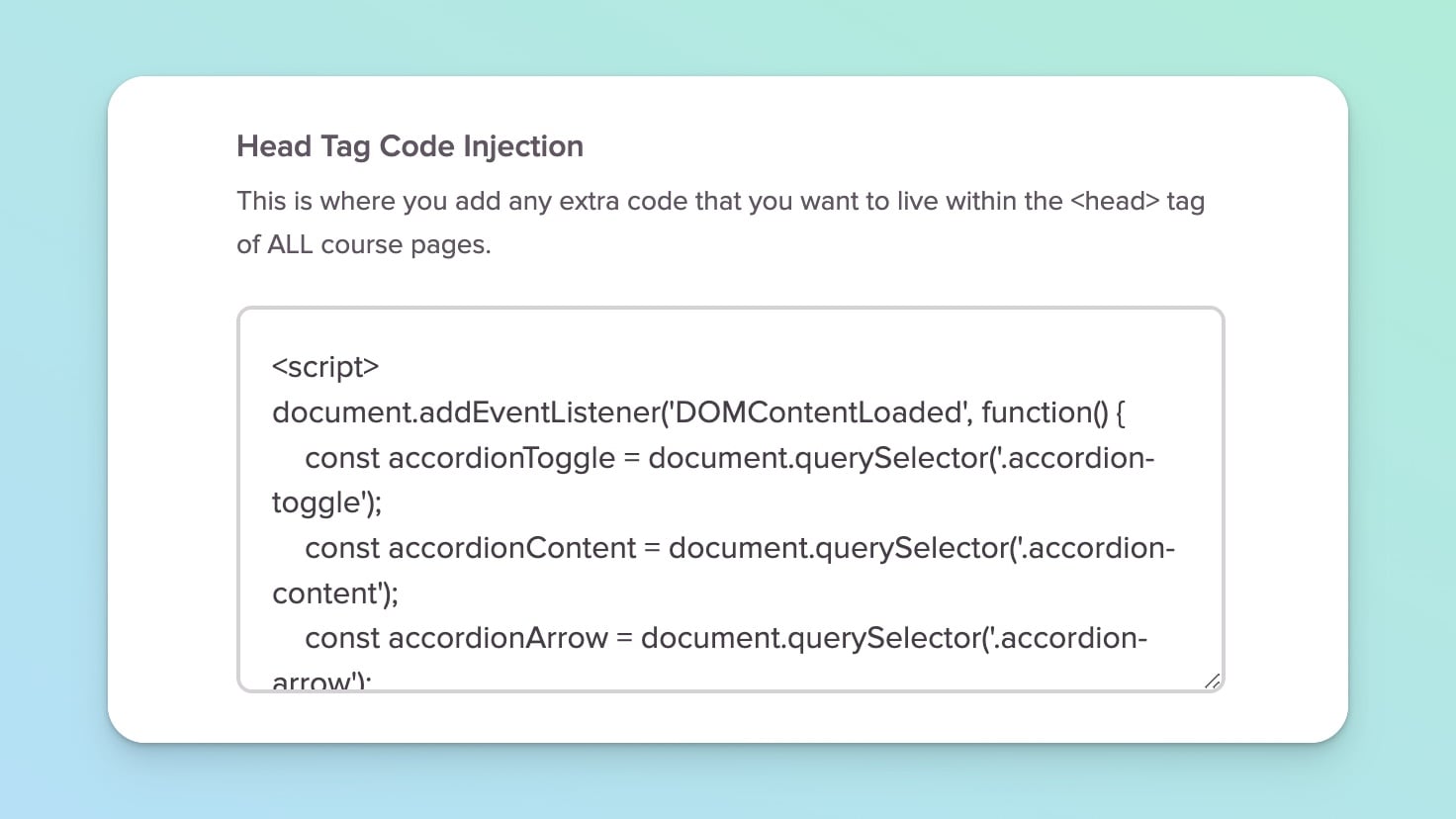
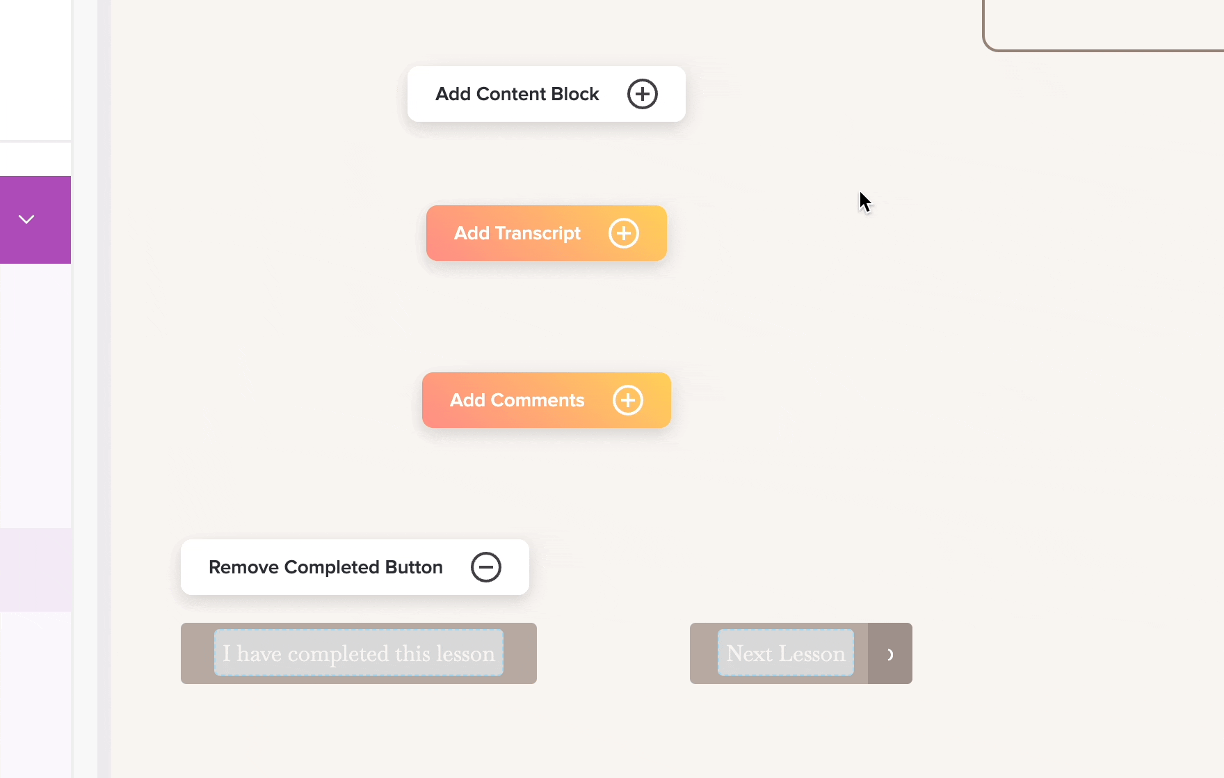
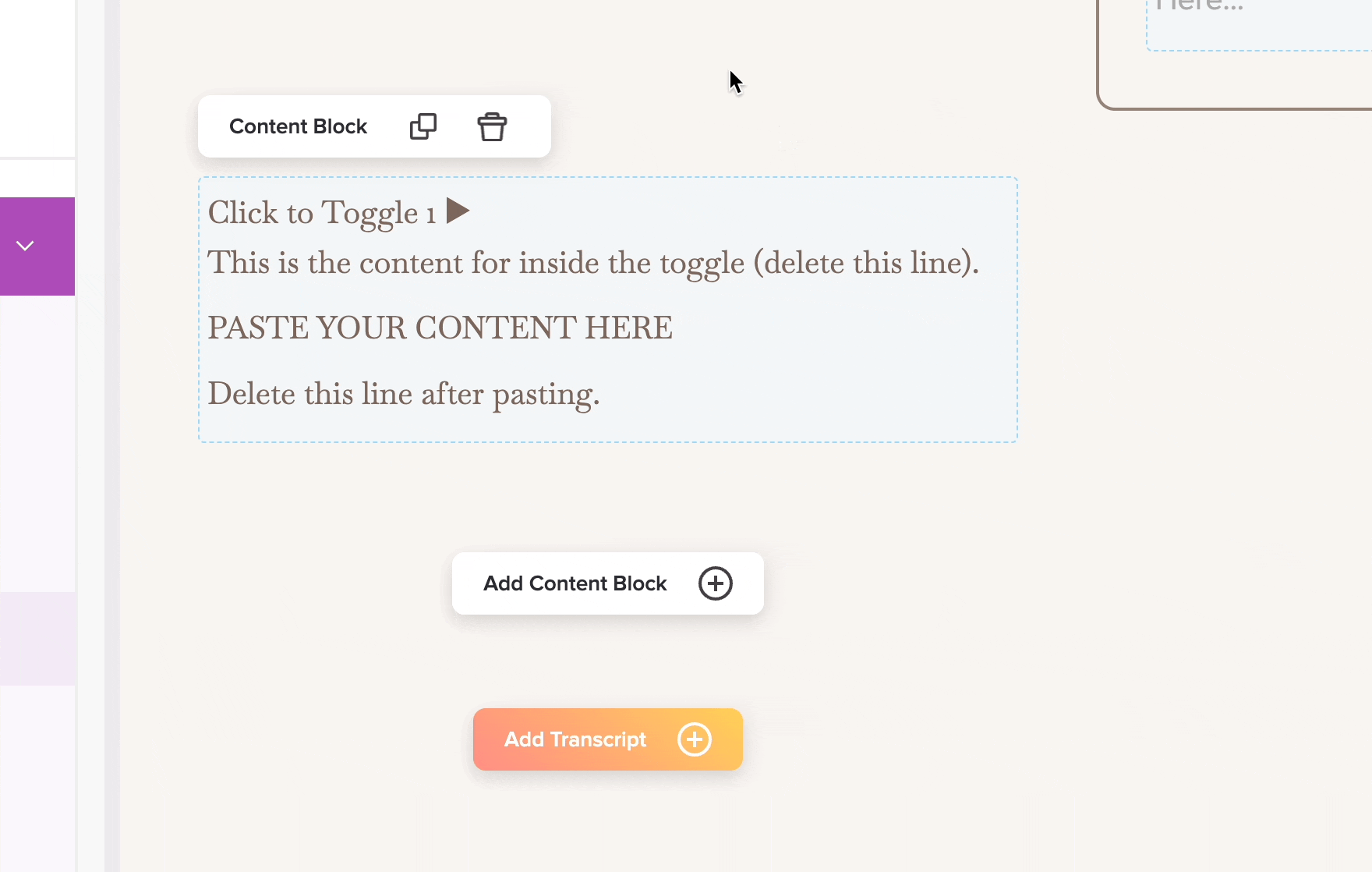
While you could use the existing "Transcript" text area in a Lesson (or Sublesson), using the Add Content Block > Add Text/Image can give you quite a bit more flexibility (plus, you could use this collapsible toggle anywhere in the Lesson page by moving the content block up or down).
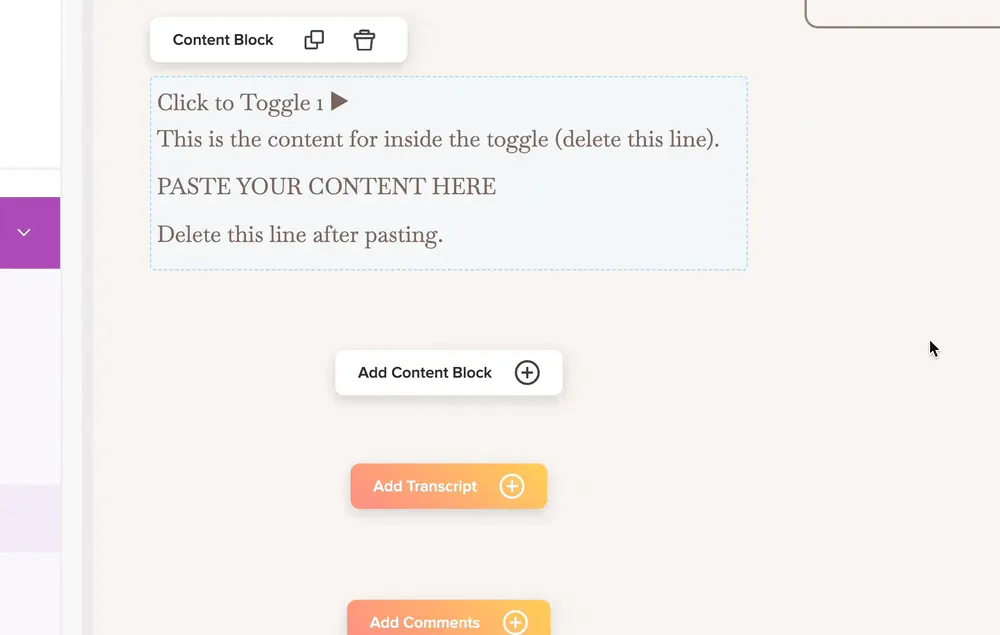
Whether you use a Text/Image block OR the Transcript text area, the next step is to type a character, highlight it, and then navigate to the Code View in the editor widget.
Once in the Code View of that text area, paste in the HTML code below and be sure to click the </> icon in the top right of the text area to save it!
<div class="accordion">
	<div class="accordion-toggle"><span class="accordion-title">Click to Toggle 1</span> <span class="accordion-arrow">▶</span></div>
	<div class="accordion-content">

		<p>This is the content for inside the toggle (delete this line).</p>

		<p>PASTE YOUR CONTENT HERE</p>

		<p>Delete this line after pasting.</p>
	</div>
</div>

Next, navigate to the Style Your Course > Add Custom CSS area within the same course.
You'll definitely want to customize the CSS colors, padding, and borders to your liking, but this block of CSS will give you a huge head start.

.accordion {
    width: 100%;
    max-width: 100%;
    margin: 20px auto;
}

.accordion-toggle {
    background-color: #f5e8dc;
    border: 4px solid #d1bba5;
    border-radius: 10px;
    padding: 20px;
    display: flex;
    justify-content: space-between;
    align-items: center;
    cursor: pointer;
    transition: background-color 0.3s ease;
    width: 100%;
    box-sizing: border-box;
}

.accordion-toggle:hover {
    background-color: #ebdbc8;
}

.accordion-title {
    color: #333;
}

.accordion-arrow {
    font-size: 24px;
    transition: transform 0.3s ease;
}

.accordion-content {
    display: none; /* Initially hide the content */
    padding: 0 20px;
    border-left: 4px solid #d1bba5;
    border-right: 4px solid #d1bba5;
    border-bottom: 0 solid #d1bba5;
    border-radius: 0 0 10px 10px;
    background-color: #f5e8dc;
    box-sizing: border-box;
    font-family: inherit;
    font-size: inherit;
}

/* When the accordion is open */
.accordion-content.open {
    display: block; /* Show content */
    padding-top: 20px;
    padding-bottom: 20px;
    border-bottom: 4px solid #d1bba5;
    visibility: visible;
}

/* Rotate the arrow when the accordion is active */
.accordion-toggle.active .accordion-arrow {
    transform: rotate(90deg);
}
That's partially why we recommend using the Text/Image Block! You can easily duplicate the block and quickly change it without having to jump into the code 🤩.
If you don't like all the extra spacing between the text blocks, you will want to use one text block.
Hope you enjoy this advanced Teachery customization tip! 👋